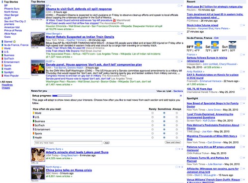
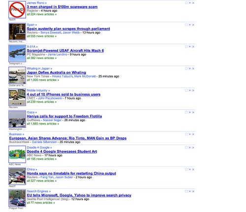
Google News seems to be constantly testing new user interfaces, features and designs. The latest design was hinted to in the Google News Help forum by Fred of Google and I spotted screen captures of it in the Google Blogoscoped Forums. Let me share those screen shots from Jérôme in the forum.
Here is the home page test:
Here is the article list test:
Jérôme has some outstanding feedback on this design:
Wow, I really hate this and it’s probably the worst change I ever had with a Google service.
It canceled all my personalizationI can’t remove the local news sectio, which must be restrict to a city-level to make sense (very poor quality otherwise)I can only have one column.I can’t chose how each topic should rank, i.e I’m forced to have the entertainment section above the health one.I have to hover each headline for about 1 second to get few words about th article. It makes absolutely no sense to wait that long compared to go directly read the article. “Japan Economic Data Worsens – Wall Street Journal – Tomoyuki Tachikawa – 3 hours ago” How meaningful is this?
Personally, I agree on many points. I don’t like the current interface for Google News, but is this an improvement?
Forum discussion at Google News Help and Google Blogoscoped Forums.

