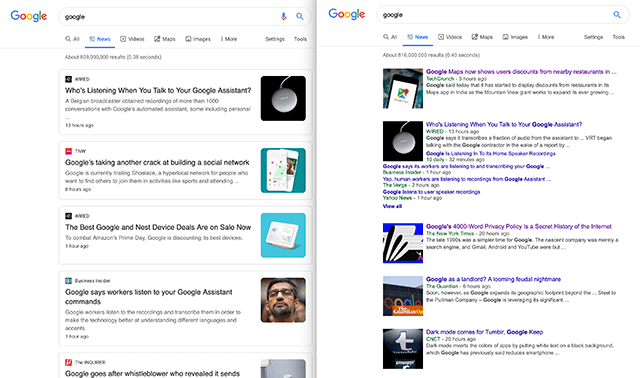
I am personally seeing the new card layout when I do searches in Google News on some browsers. On Chrome Mac, I get the card layout but on Safari Mac I get the old bundled list layout.
Here is a screen shot showing the layouts side by side, you can click to enlarge:
This design looks more like the mobile interface for Google News search.
I personally prefer the old format because it shows more sources about the same topic right on the same screen.
Forum discussion at Twitter.
Update: Not a test but it is rolling out, here is a tweet from Google:


